Provo City School District Style Guide
At Provo City School District, we’re all about student success. That also applies when it comes to our verbal and visual identity. We use consistent fonts, colors, photographs, designs, logos, and themes to advance our mission to help every student succeed. These brand guidelines will help strengthen your messaging and make it easier for us to represent PCSD.
Brand Voice
Welcome. Educate. Inspire.
The Provo City School District is a vibrant learning environment where all students become lifelong learners and engaged community members.
Our brand voice reflects that philosophy. No matter what you’re writing, if the personality and emotion behind your words match that voice; you’ll be showing what makes us PCSD.
The PCSD voice is based on four principles: Empower your audience:
- Project positive energy that empowers readers to engage in learning and feel empowered to assist their children and students in learning.
- Be friendly: Embrace your audience and treat them as who they are — a vital part of our student’s education; they’re a part of the Provo family.
- Represent the brand: Keep PCSD at the forefront of all communication and messaging.
- Be authentic: Appeal to your audience with honest and genuine communication.
When you use these principles in your communication, you’ll end up with messaging that represents PCSD’s voice. You don’t have to use all four in every message —consider your audience and objectives and select the most relevant principles.
Visual Identity
Consistency is Key
Our brand’s visual identity demonstrates our commitment to welcome, educate and inspire in Provo. A collaboration of students created our logo, and our colors represent each of our high schools.
The PCSD aesthetic is characterized by
- Clean lines and logos
- Ample spacing
- Traditional clean fonts
- Blue, green, and oranges colors
- Simple, stylish line icons and graphics
Consistency is key for communicating. To maintain our visual identity and build district recognition, follow the standards in this guide for all graphic design elements.
Logo
A logo is often the first thing people notice when they see an asset. Use the official versions of the PCSD logo below to identify the district in different situations.
- Spacing
- Give the PCSD logo ample negative space for clear recognition. Clear space protects the mark from distraction. Nothing should overlap with the symbol or interfere with its legibility.
- Sizing
- Make sure the logo is proportionally sized to command attention. Depending on your asset, you’ll need to adjust the logo’s size so it’s neither overpowering (too large) nor understated (too small).
- Distortion
- Do not stretch or distort the logo in anyway.
Main Logo Styles
The main logo style is shown below.
![]()
or with our “Welcome, Educate and Inspire” Mission.
![]()
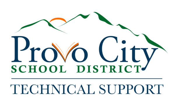
Secondary Logo Style
Secondary styles must:
- Use the district colors or black and white
- Use the district fonts
- Be approved by the communication department
Below are samples of approved secondary logos.
![]()
![]()
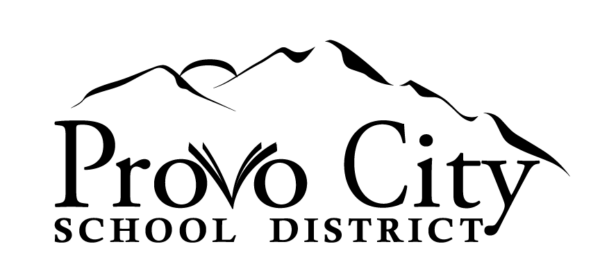
Department Logos
A department may add their name under the logo as shown below. If you would like help adding your department reach out to the Communications Department.
Inappropriate Logo Use
Using logo variations or other logos when representing PCSD is not permitted. Please consult with the Communication department for use of any other branding.
Brand Fonts
Our brand identity is communicated not only through our words but how these words look. We use traditional, linear fonts to create recognizable, professional, and uniform messaging across all departments.
General Use Fonts
The fonts listed below are free and can be easily downloaded from fonts.google.com.
- Source Sans – Available in Extra Light, Light, Regular, Semibold, Bold, Black
- Source Serif – Available in Extra Light, Light, Regular, Semibold, Bold, Black
- Montserrat Available in Extra Light, Light, Regular, Medium, Semibold, Bold, Extra Bold, Black
Logo Font
The font used in the logotype is also a general use font and easy to download through fonts.google.com.
Colors
Our brand colors were carefully decided in a way to represent each of our high schools. Please make sure you are using the right blue green and orange to maintain PCSDs brand consistency. Below are the correct color hexes to reference.
Blue

- CMYK 100 / 80 / 38/ 31
- RGB 14 / 55 / 91
- HEX #10365a
- Tint 50%, 40%, 30%, 20%, 10%
Green

- CMYK 89 / 33 / 100 /26
- RGB 12 / 105 /54
- HEX #0c6936
- Tint 50%, 40%, 30%, 20%, 10%
Orange

- CMYK 0 /74 / 100 /1
- RGB 231 / 101 / 35
- HEX #e76523
- Tint 50%, 40%, 30%, 20%, 10%
Imagery
Visual communication is a powerful tool we embrace at PCSD. Through captivating imagery, we strive to show our audience that our employees care, that our students are engaged, and that PCSD is a thriving community.

Using pictures and videos of PCSD students and staff is highly encouraged.

The Communications Department has a collection of district images for you to choose from, visit the shared Google Drive to see what’s available. They are also available to come take needed pictures.
Design Services
The Communication Department is here to help.
The Communications Department can help you with any design need. If you would like assistance with your project, please use the Tech work order system or contact the Communications Department listed on the sidebar.
Common Mistakes
Please review these common mistakes that diminish the brand, making us look unprofessional.
- All Caps. It is not necessary to use ALL CAPS to make your point. Try using bold, italics, bulleted lists, and hierarchy of scale instead.
- Excessive exclamation point. Excessive exclamation points dilute the purpose. Try not to overuse them.
- Using unprofessional fonts. Our fonts need to be clean and professional. Comic Sans is not on the list.
- Multiple Font Styles in single document. One font with different weights and a special header font is all that is needed.
- Spelling and grammar mistakes. Always have a fresh set of eyes check your work.
- Leaving out city in district name. Please refer to the district as Provo City School District, not Provo School District. It is a point of pride that we are a city district; please remember to use the city when writing out the name.
- Waiting until the last minute to think about your design. Please think ahead.
- Overdoing it. Sometimes you need something consistent rather than unique. We want consistency, clean lines, and simple, tasteful design.